# we import the pandas library
import pandas as pdExploratory Data Analysis and Groupby using Pandas
Learning Goals
- Understand the relationship between path and file location
- Distinguish between relative and absolute paths
- Apply the
.groupby()method to aggregate data.
We continue to work with the Palmer Penguin dataset from last week, which was shared in the folder for week 4: W4_Pandas_And_Environmental_Data.
Using paths to specify file locations
This is a good time to think a bit more about data and code organization on your computer. For the program to be able to read the dataset, it needs to know where to find it. Computers do this through what is called absolute and relative paths.
The absolute path is the location of the file within your computer’s file system. In my case, a Windows PC, the file location of the dataset is:
D:\GitHub\ISAT_420_S26_Shared\W4_Pandas_And_Environmental_Data\Data\palmer_penguin_data.csv. Using absolute paths to find files can be problematic, because the absolute location of the file will be different on everybody’s machines.A relative path is a way for specifying file location in relationship to each other. Our shared repository is organized using hierarchical folders. As a convention python code is executed in the directory that it is located. If we follow the directory outline below, we can find the relative path of the
palmer_penguin_data.csvin relation to this jupyter notebookw5_pandas_groupby.ipynb. To find the file, we would need to go back to theISAT_420_S26_Shareddirectory and then travel down into theDatadirectory insideW4_Pandas_And_Environmental_Data.ISAT_420_S26_Shared| |-W4_Pandas_And_Environmental_Data| | |-Code | |-Data| | |-palmer_penguin_data.csv |-W5_Pandas_Groupby_And_Timeseries| |-Code| | |-w5_pandas_groupby.ipynb | |-DataAs a relative path, this can be expressed as:
../../W4_Pandas_And_Environmental_Data/Data/palmer_penguin_data.csv, where the../means move one directory up.We can now read in our dataset just like last week.
df_penguins = pd.read_csv('../../W4_Pandas_And_Environmental_Data/Data/palmer_penguin_data.csv',
                          sep = ',',
                          na_values='NA',
                          skiprows= 1,
                          index_col=0   # Use the first column as the index of the DataFrame
                          )
df_penguins

df_penguins.head()| species | island | bill_length_mm | bill_depth_mm | flipper_length_mm | body_mass_g | sex | year | |
|---|---|---|---|---|---|---|---|---|
| rowid | ||||||||
| 1 | Adelie | Torgersen | 39.1 | 18.7 | 181.0 | 3750.0 | male | 2007 |
| 2 | Adelie | Torgersen | 39.5 | 17.4 | 186.0 | 3800.0 | female | 2007 |
| 3 | Adelie | Torgersen | 40.3 | 18.0 | 195.0 | 3250.0 | female | 2007 |
| 4 | Adelie | Torgersen | NaN | NaN | NaN | NaN | NaN | 2007 |
| 5 | Adelie | Torgersen | 36.7 | 19.3 | 193.0 | 3450.0 | female | 2007 |
Exploratory Analysis
In order to be able to ask any science questions, we need to have a basic understanding of the dataset. We have already seen that we can get basic statistics with the .decribe() method.
df_penguins.describe()| bill_length_mm | bill_depth_mm | flipper_length_mm | body_mass_g | year | |
|---|---|---|---|---|---|
| count | 342.000000 | 342.000000 | 342.000000 | 342.000000 | 344.000000 |
| mean | 43.921930 | 17.151170 | 200.915205 | 4201.754386 | 2008.029070 |
| std | 5.459584 | 1.974793 | 14.061714 | 801.954536 | 0.818356 |
| min | 32.100000 | 13.100000 | 172.000000 | 2700.000000 | 2007.000000 |
| 25% | 39.225000 | 15.600000 | 190.000000 | 3550.000000 | 2007.000000 |
| 50% | 44.450000 | 17.300000 | 197.000000 | 4050.000000 | 2008.000000 |
| 75% | 48.500000 | 18.700000 | 213.000000 | 4750.000000 | 2009.000000 |
| max | 59.600000 | 21.500000 | 231.000000 | 6300.000000 | 2009.000000 |
Exploratory plots
Making plots is another good way of understanding our data. Pandas allows us to make plots easily. For example, we can use the build-in .plot()-method to create many plots including: barplots, scatter plots, histograms, …
Let’s create histograms for bill_depth_mm and body_mass_g.
This can be done with a single line of code:
df_penguins.plot(kind='hist', column = 'bill_depth_mm', bins=20, xlabel='Bill Depth (mm)', title='Histogram of Bill Depth')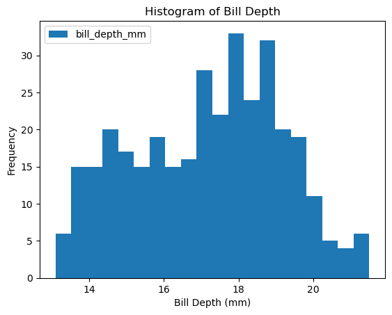
df_penguins.plot(kind='hist', column = 'body_mass_g', bins=20, xlabel = 'Body Mass (g)', title='Histogram of Body Mass')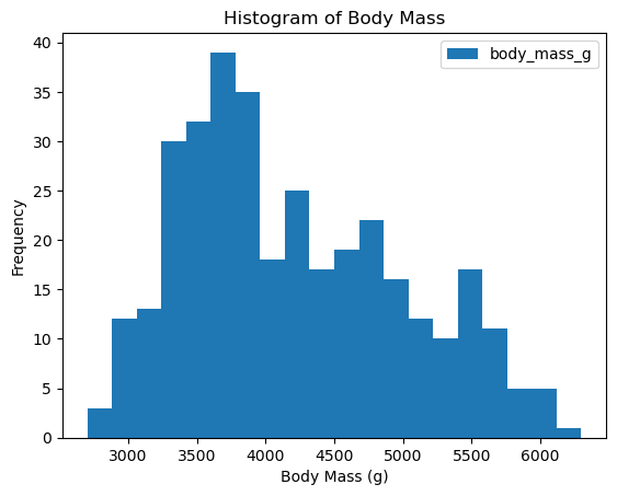
The data looks a bit wonky, there is more than a single peak for body mass and bill depth.
Sometimes it helps to look at more than one variable at the same time. So let’s create a scatter plot:
df_penguins.plot(kind='scatter', x='bill_length_mm', y='bill_depth_mm')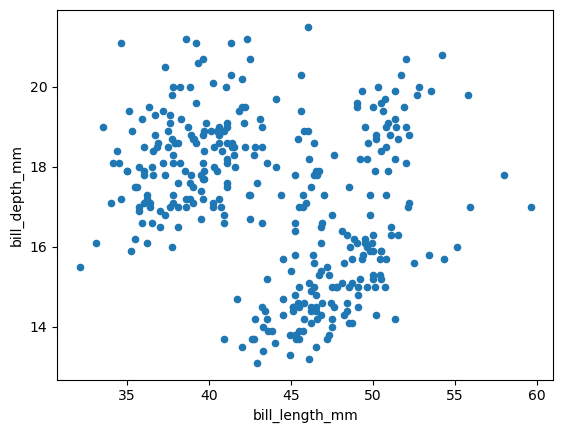
Based on this scatter plot, do you have a hypothesis on what might be causing this distribution?
Pandas: Groupby
groupby is an amazingly powerful function in pandas. But it is also complicated to use and understand. The point of this lesson is to make you feel confident in using groupby.
- Split: Partition the data into different groups based on some criterion.
- Apply: Do some calculation within each group.
- In our case this might be an aggregation step like calculating the mean or getting a count for each group.
- Combine: Put the results back together into a single object.
This is visualized in the diagram below:

How would something like this look for our example?
In pandas we like to write one-liners that string these steps together.
Let’s look at one example:
df_penguins.groupby('species').count()| island | bill_length_mm | bill_depth_mm | flipper_length_mm | body_mass_g | sex | year | |
|---|---|---|---|---|---|---|---|
| species | |||||||
| Adelie | 152 | 151 | 151 | 151 | 151 | 146 | 152 |
| Chinstrap | 68 | 68 | 68 | 68 | 68 | 68 | 68 |
| Gentoo | 124 | 123 | 123 | 123 | 123 | 119 | 124 |
Let’s discuss what this means. We can see that there are 152 Adelie penguins that have a record within the island columns, compared to 68 Chinstrap and 124 Gentoo penguins. We can also see that the counts are not the same in all columns.
Why is that?
How about we now see how the bodies of these penguins compare using groupby and mean:
Note: Since we cannot calculate the mean for non-numeric columns like sex, we select only columns with numbers for the aggregation step.
df_penguins.groupby('species')[['bill_length_mm','bill_depth_mm','flipper_length_mm','body_mass_g']].mean()| bill_length_mm | bill_depth_mm | flipper_length_mm | body_mass_g | |
|---|---|---|---|---|
| species | ||||
| Adelie | 38.791391 | 18.346358 | 189.953642 | 3700.662252 |
| Chinstrap | 48.833824 | 18.420588 | 195.823529 | 3733.088235 |
| Gentoo | 47.504878 | 14.982114 | 217.186992 | 5076.016260 |
We can even directly make a plot from the groupby results.
df_penguins.groupby('species')[['bill_length_mm','bill_depth_mm','flipper_length_mm','body_mass_g']].mean().plot(kind = 'bar')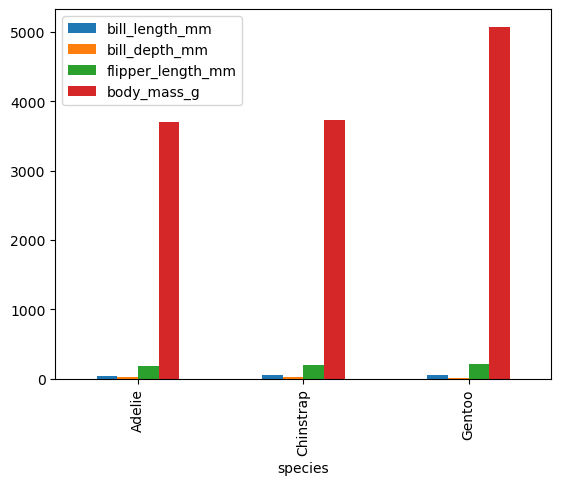
We can now go back to one of our first plots and separate the different species by color. We have not discussed each of these commands, but in short. I am making 3 plots which are plotted into the same figure as defined by the axes ax.
This is difficult to do when only using pandas. However, pandas is using the matplotlib graphing library in the background. Using matplotlib directly, we can make this plot.
import matplotlib.pyplot as plt

fig, ax = plt.subplots()
df_penguins.loc[df_penguins['species'] == 'Adelie'].plot(kind='scatter', x='bill_length_mm', y='bill_depth_mm', color = 'red', ax=ax, label='Adelie')
df_penguins.loc[df_penguins['species'] == 'Chinstrap'].plot(kind='scatter', x='bill_length_mm', y='bill_depth_mm', color = 'blue', ax=ax, label='Chinstrap')
df_penguins.loc[df_penguins['species'] == 'Gentoo'].plot(kind='scatter', x='bill_length_mm', y='bill_depth_mm', color = 'orange', ax=ax, label='Gentoo')
ax.set_xlabel('Bill Length (mm)')
ax.set_ylabel('Bill Depth (mm)')
Text(0, 0.5, 'Bill Depth (mm)')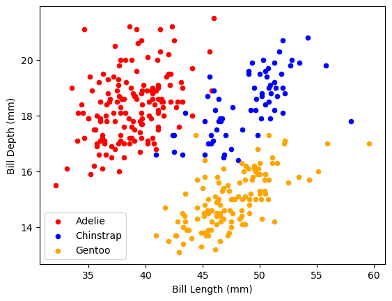
Conclusion
- We now have a better understanding of the dataset
- Simple plotting functions and the
.groupbymethod have helped us make sense of how the data looks like. - Once we have an understanding of what our data means, we can start thinking about what questions we can use it to answer.